On this page
The dashboard is one query: GROUP BY category, week over the classifier’s output. Each week the line for “impersonation scams” ticks up a little, and someone asks how fast it is growing. The classifier behind it is good — about 95% accurate on the mix it was trained on — so the chart gets read as the trend.
It is not the trend. It is the trend multiplied by a number smaller than one, plus a constant, and the multiplier changes every time somebody improves the model. Every estimate gets pulled toward a point that has nothing to do with the world. The more a classifier trades recall for precision, the flatter the line it draws.
Operating rule. How fast a category is growing is a quantification problem, not a classification problem. Never report the count of predicted labels as prevalence. Correct it with the classifier’s error rates, or with a small random sample of human labels from the same period. Then treat every change of model, prompt or taxonomy as a break in the measurement, not as news.
This came out of a research note I wrote for a team that wanted category trends from model-labelled fraud and scam reports. Their data stays private, so every number below comes from a seeded simulation I wrote for this post, which anyone can rerun: it is public as prevalence-shift, and its CI fails if the published figures stop reproducing.
Why counting flattens a trend
For a binary category with true prevalence p, a classifier with true-positive rate TPR and false-positive rate FPR labels this share of items positive:
counted share = FPR + (TPR − FPR) × p
That is a straight line in p with slope TPR − FPR. It has two consequences, and both are invisible from inside the classifier.
First, every change in the true share arrives shrunk by TPR − FPR. A classifier with a true-positive rate of 0.645 and a false-positive rate of 0.0166 has TPR − FPR = 0.63, so a counted trend shows 63% of the real one. Second, every estimate is pulled toward the point where the line crosses the diagonal, FPR / (1 − TPR + FPR). Here that is about 4.5%: a category rarer than that is overstated, and anything more common is understated by more as it grows.
Nothing about this classifier is unusual. It is tuned the way most production classifiers are tuned — a 0.5 threshold on a posterior trained where the category was 10% of traffic, which favours precision over recall. It is 95% accurate at that 10%, and it still reports a growing category as growing more slowly than it is.
The fix has existed for nearly two decades. George Forman’s adjusted classify-and-count inverts that line: estimate TPR and FPR on labelled data, then solve for p. Lipton, Wang and Smola showed the multi-class version — black-box shift estimation — works even when the classifier is biased or uncalibrated, as long as its confusion matrix is invertible. The Saerens–Latinne–Decaestecker procedure takes the probabilistic route, re-weighting posteriors toward a new prior by expectation-maximisation. The open-source QuaPy library implements these and more. What I wanted to know was how large the errors are in practice, and which estimators survive the two things that actually happen: miscalibrated scores and model upgrades.
The rig
Everything is synthetic and seeded. Each of 12 periods draws 5,000 reports. The true share of one category rises linearly from 10% to 25%. The classifier’s scores are Gaussian, separated so that it is 95.0% accurate at the training prior of 10%, with a true-positive rate of 0.645 and a false-positive rate of 0.0166. Its posteriors are the exact Bayes posteriors at that prior, so it is perfectly calibrated where it was trained — the most favourable case for anything that uses probabilities.
Six estimators run on every period:
| Estimator | What it uses | What it trusts |
|---|---|---|
| CC — classify and count | Hard labels on all 5,000 | That the classifier is perfect |
| PCC — probabilistic CC | Posteriors on all 5,000 | That posteriors are calibrated for this period |
| ACC — adjusted CC | Hard labels, plus TPR/FPR from a 2,000-item validation set | That error rates did not change since validation |
| SLD — EM prior adjustment | Posteriors on all 5,000 | That posteriors are calibrated at the training prior |
| GOLD | 200 random human labels from the period | Nothing; it ignores the classifier |
| PPI — prediction-powered inference | Hard labels on all 5,000, plus the same 200 labels | Nothing; the labels correct the classifier’s error |
PPI is the one that takes some explaining. It is the counted share plus the average of (true label − predicted label) on the random gold sample. The second term is a measured correction for whatever bias the classifier has this period, so the estimate is unbiased without any assumption about the classifier, and the predictions on the other 4,800 items shrink its variance. Its standard error comes from both pieces.
q = yhat.mean()                                # counted share, all N items
rect = y[gold] - yhat[gold]                    # classifier error on the gold sample
ppi = q + rect.mean()
se = np.sqrt(yhat.var(ddof=1) / N + rect.var(ddof=1) / n_gold)
Each scenario runs 1,000 replications with a fresh validation set per replication. The intervals are 95%; “coverage” is the share of the 12,000 period estimates whose interval contains the true value. The whole run takes 7.2 seconds of CPU on an Apple M5.
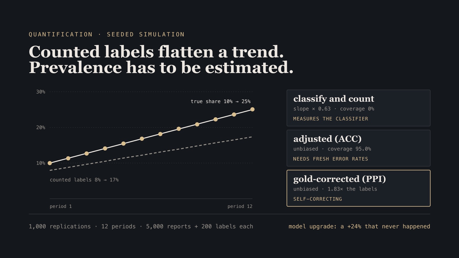
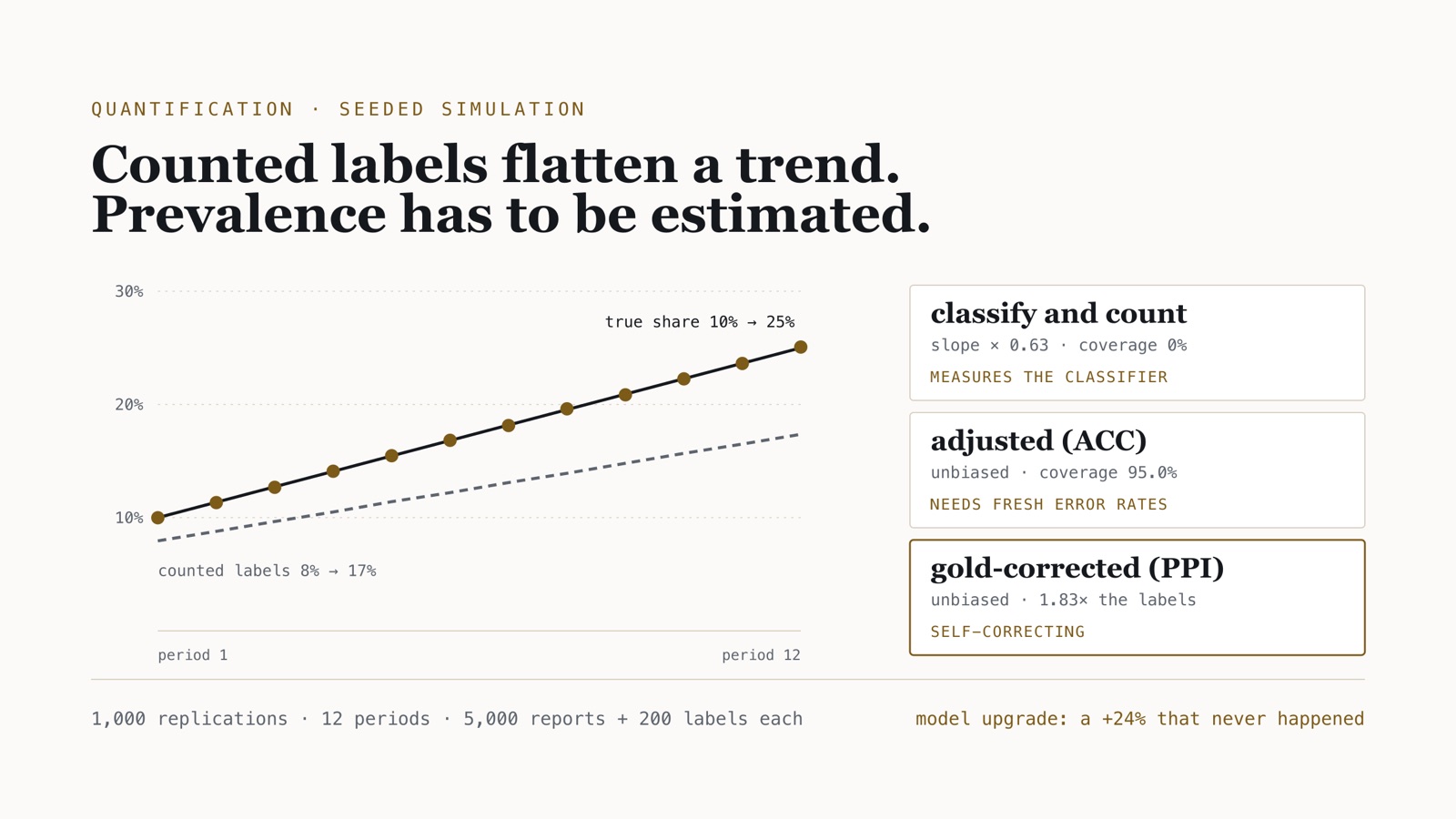
Counting drew a third of the trend
| Estimator | Period 1 (true 10.0%) | Period 12 (true 25.0%) | Slope ÷ true | RMSE | 95% CI coverage | Mean CI width |
|---|---|---|---|---|---|---|
| CC | 7.95% | 17.36% | 0.628 | 0.0517 | 0.0% | 0.0183 |
| PCC | 10.00% | 18.65% | 0.577 | 0.0376 | — | — |
| ACC | 10.04% | 25.08% | 1.003 | 0.0130 | 95.0% | 0.0503 |
| SLD | 10.00% | 24.98% | 1.000 | 0.0067 | — | — |
| GOLD | 10.07% | 25.04% | 1.002 | 0.0268 | 94.3% | 0.1033 |
| PPI | 9.99% | 25.07% | 1.003 | 0.0196 | 94.7% | 0.0763 |
Classify-and-count reported a rise from 8% to 17%. Its trend slope was 0.628 of the true slope — exactly TPR − FPR, as the algebra says. The final period was understated by 7.6 percentage points.
The error bars are the worse part. If you compute the usual binomial interval on the counted share, treating predicted labels as data, you get an interval 1.8 points wide that contained the true value in none of the 12,000 period estimates. It is not a noisy estimate with honest uncertainty. It is a precise estimate of the wrong quantity. Egami and colleagues make the same point about model-annotated data in general: using surrogate labels as if they were ground truth produces bias and invalid confidence intervals even when the surrogate is highly accurate.
Probabilistic counting does not rescue it. Averaging calibrated posteriors is exact at the training prior — period 1 is spot on — and drifts as soon as the prior moves, recovering 58% of the slope. Calibration is a property at a prior, and the whole point of a trend is that the prior moves.
Every corrected estimator recovered the trend. They differ in what they cost and what they assume:
- SLD was the most precise by a distance, at an RMSE of 0.0067, because in this scenario its one assumption is true by construction.
- ACC was unbiased with honest intervals (95.0% coverage), at the cost of width: its variance carries the validation set’s uncertainty in TPR and FPR, divided by (TPR − FPR)². A weaker classifier makes ACC noisier, not wrong.
- GOLD alone was unbiased and honest too, and the widest by far: 200 labels give an interval 10 points wide.
- PPI used the same 200 labels and was 26% narrower than GOLD, with 94.7% coverage. Squaring the width ratio, the predictions were worth about 1.83 times as many labels — the same as labelling about 367 items instead of 200.
Calibration is an assumption, not a property
Scenario B changes one thing: the posteriors are over-confident. I doubled the logits, which leaves every hard label identical — a score above the threshold stays above it — and makes every probability more extreme. Modern neural classifiers are often over-confident in exactly this way.
| Estimator | Period 12 (true 25.0%) | Slope ÷ true | RMSE | 95% CI coverage |
|---|---|---|---|---|
| CC | 17.37% | 0.627 | 0.0518 | 0.0% |
| ACC | 25.15% | 1.003 | 0.0131 | 95.3% |
| SLD | 19.68% | 0.775 | 0.0387 | — |
| PPI | 24.97% | 0.993 | 0.0193 | 95.3% |
SLD went from the best estimator to recovering 78% of the trend and understating the last period by 5.3 points. ACC and PPI did not move, because they never read a probability: they use hard labels and labelled data, and the hard labels did not change. That matches Esuli, Molinari and Sebastiani’s reassessment of SLD: the method helps when classes are few and the classifier is calibrated, and can make things worse when it is not.
The operating consequence: use SLD when you have evidence the posteriors are calibrated on recent data, and keep an estimator that does not need them running beside it. When the two disagree, the disagreement is a calibration alarm.
The model upgrade that looked like a trend
Scenario C holds the true share flat at 15% for 12 periods. After period 6 the classifier is replaced by a better one: true-positive rate 0.869 instead of 0.645, false-positive rate 0.0087 instead of 0.0166. Nothing in the world changes.
| Estimator | Periods 1–6 | Periods 7–12 | Apparent change | False-trend rate |
|---|---|---|---|---|
| CC | 11.09% | 13.77% | +24.2% | 100.0% |
| ACC with the old error rates | 15.10% | 19.40% | +28.6% | 100.0% |
| ACC with refreshed error rates | 15.10% | 15.00% | −0.6% | 30.4% → 5.0% |
| PPI | 15.00% | 15.01% | 0.0% | 5.8% |
The false-trend rate is the share of replications in which a two-sided test at α = 0.05 called the before/after difference significant. The right answer is 5%.
Counting reported a 24% rise and a test flagged it in every replication. The adjusted estimator with stale error rates was worse than counting: it divided the new model’s counts by the old model’s sensitivity and reported a 29% rise. A better model, an unchanged world, and a chart that says the category grew by a quarter.
Refreshing the error rates — validating the new model before using it — removed the bias. It also exposed a subtler mistake in my own first analysis. Treating the twelve periods as independent, the test still raised a false alarm 30.4% of the time. The validation set’s error is shared by every period scored against it, so it does not average down across periods. Counting that variance once per half, as it should be, brought the false-trend rate to 5.0%.
PPI needed none of that. Its gold sample is drawn fresh every period, so the correction tracks whichever model is running, and its false-trend rate was 5.8% with no special handling. That is the property worth paying for: a measurement that corrects itself when the instrument changes.
Boundary. This is a simulation. The classifier is an idealised Gaussian-score model, one category is tracked at a time, the gold sample is uniformly random with known size, and label shift is pure — the share changes, while what a report in each category looks like does not. Real report streams break that last assumption when scripts evolve inside a category, and they add problems the simulation leaves out: a mix of sources with different reporting habits, campaign duplicates, and categories too rare for any per-period estimate. What transfers is the direction and mechanism of each bias, not the magnitudes. Every figure here is in the lab’s MEASUREMENTS.md, rendered from the results file by script.
After the estimate: shares, rates and alarms
A per-period prevalence with an honest interval is the input to the trend, not the trend. Three more decisions sit on top of it, and each has a characteristic way of going wrong.
| Question | Model it as | The mistake it prevents |
|---|---|---|
| Is this category taking a larger share? | Shares on the simplex, through a centred log-ratio (clr) transform | Raw shares are compositional: one category “falls” because another grows, and correlations between percentages are spurious |
| Are there more of them? | Counts with a negative binomial model and a log-exposure offset | A count chart measures your ingestion volume and source onboarding, not the world |
| Is something happening right now? | EWMA or CUSUM charts on residuals from that baseline | A week-on-week percentage on a small category is noise presented as news |
| How big was it, and when did it start? | A segmented interrupted time series | Prospective alarms are tuned to fire early, not to size an event |
Two practical rules carry most of the weight. First, compute trends within each source and combine them with weights that are fixed for the whole series; a new source is a break in the sampling frame, not growth. Second, a taxonomy needs to classify on the stable axis. The Federal Reserve’s ScamClassifier groups scams by mechanism — two categories, nine types such as bank impostor or investment — rather than by the brand being impersonated this month, which is what keeps a series comparable over a year.
What goes on the dashboard
- A prevalence estimate from an adjusted estimator, never a count-derived percentage.
- Its interval from a per-period random gold sample (PPI or a doubly-robust equivalent), never a binomial interval on predicted labels.
- Two estimators that rest on different assumptions, such as SLD and ACC, plotted together; their disagreement is a calibration alarm.
- A
measurement_versionon every row — model, prompt, taxonomy and normalization — and no plot across versions without an explicit bridge. - Error rates re-estimated for any new model before its first period is published, with the validation set’s variance counted once rather than averaged across periods.
- Shares and rates reported together, with the exposure denominator named on the chart.
Frequently asked questions
Why is classify-and-count biased when a category’s share changes?
The share of items labelled positive equals FPR + (TPR − FPR) × true prevalence. Unless the classifier is perfect, that line has a slope below one, so every change in the true share is shrunk by TPR − FPR and every estimate is pulled toward a fixed point. In the simulation a 95%-accurate classifier recovered 63% of the true trend.
What is the difference between ACC, SLD and prediction-powered inference?
ACC corrects the counted share using TPR and FPR estimated on labelled validation data. SLD re-weights calibrated posteriors by expectation-maximisation and is the most precise when the posteriors really are calibrated. PPI adds the average error measured on a small random labelled sample from the same period, which makes it unbiased without trusting the classifier at all.
How many human labels per period do you need for an honest trend?
In this simulation 200 random labels per period, combined with predictions on 5,000 items, gave unbiased estimates with 95% intervals that covered the truth 94.7% of the time and were 26% narrower than using the 200 labels alone — worth about 1.83 times as many labels.
What happens to a trend chart when you upgrade the classifier?
It moves even when the world does not. With a flat true share of 15%, a better model raised the counted share by 24% and a test flagged a significant change in every replication. A per-period gold sample, or an error-rate estimate refreshed for the new model, removed the step.
The same discipline — decide the unit you are measuring before you choose a model — runs through the short-text triage lab and the consulting work this note came from. More on applied ML and evaluation and data quality.